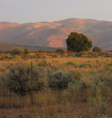
Personal Art Blog

Sharing the lessons I teach at the Artist Guild and the personal discoveries in my art.

Friday, May 20, 2016

Transparents in the Landscape


New Mexico Light
8x6" oil on Linen Panel $140. SOLD


Artist Note.
I belong to a group of
painters who issue a
Challenge to paint from
a photo of New Mexico

This is Challenge #10 for 2016
So beautiful and typical of NM.

At the Guild this month
we are learning the joys of using
a transparent color foundation
so I thought I would demo this
image to one of the classes.

Transparent colors used:
Indian Yellow
Alizarin Perm.
Ultramarine Blue.

Starting with very thin
coat of  IY
all over and
lifting off cleanly with rag and Gamsol
where I will place the
blue of the mountain
(don't want it green!)
T
Add a touch of Aliz
to the IY for the
warm ground, etc.
Aliz and UB for the purple
Adding UB and IY with hint
the purple for the Green.
Simple shapes of value and color
at this stage.

I moved the peak of the mountain
slightly to the side to avoid
having it directly
over the featured bush. 
All transparent colors for block in.

Starting to add opaques on sky, 
mountain and top area of ground

It could be considered finished
at this point but
 nearly all the
transparent areas 
have been covered and 
it is looking too heavy.
for my taste.

Not sure I liked seeing so much of the 
warmer colors behind the featured bush
so below you can see changes 
I made to that area area

 Choice to be made
I decide on this one.

Now to tackle the other
changes
 I have some major issues 
with the front bushes 
competing with the focal area. 
Also all the transparent glow 
has been lost,
I decided to test what it 
would look like if I removed 
 the front bushes. 
I placed a piece of glass 
over and painted on it first.
Yep - I can see it opened it up.

Then I restored all the 
golden transparent color with 
IY and Aliz. making the foreground
rich and glowing...once again.
Not shown on the one above.

Next - 
I lowered the big bush at its base
and add another bush to balance 
it over on the left. I added a strip 
of light behind the 
large bush area to 
set back the mountain even more
and bring the bush forward.
I placed a strip of fence in 
front of the left bush
to add to the feeling of distance.

Finally getting to where I feel
I have made the painting my own.

I admire the way each artist 
in Lets Paint New Mexico
has a different viewpoint 
from the same image.
Scroll though the link 
below
and look at all the great paintings. 
Some fun challenges are on there.


Tuesday, May 17, 2016

Impression of Roses


Impression of Roses
6x8in oil on canvas panel $140. SOLD


Artist Note
This is another painting 
following the Transparent
underpainting demo I 
showed on my previous post.

This demo was to see how 
far opaques could be used 
and still keep the glow.

Only the dark areas
are truly transparent with 
tiny areas of a thin layer
 of Indian Yellow 
peeking here and there
though everywhere else.

This one is more decorative
in style. More of an illusion.
The flowers are interesting
because only one has the 
actual shape of a flower, 
the rest are simple shapes 
of color with no detail.

In class today 
we started on the 
landscape -  using the 
transparent colors.
I will show the steps for
that demo in my next post.


Friday, May 13, 2016

The Important Transparents - demo steps


Mixed Bouquet.
6"x 6" oil on canvas  $110.  SOLD

This was a demo to show the importance
of having a transparent underpainting.

Artist Note.

I am a big believer in leaving
some of the darker areas in
 a painting, transparent. 
There is a certain glow which 
doesn't happen with opaque
dark areas  - in fact I find
they can look, pretty "chalky."

My transparent colors 
used for the demo were:
Viridian
 Transparent Oxide Yellow TYO
Alizarin (permanent)
Ultramarine Blue.

 After a wash of TOY 
I did a mass shape using  Viridian.
Next I lifted out the lighter areas
using a rag.

I followed this with more lifting
with a small amount of Gamsol
on my rag and a scrubby brush.
This was to hit my lightest areas. 

I added Viridian and Ultra 
with touch of Aliz to make darker
greens in jar and leaves.

I added more TOY to back and front.
and shadowed the area 
behind the jar
 linking into the dark leaves

Bringing in color but making
sure to keep it all transparent.

Then the fun part - I fractured it!
(See FREE tutorial on tools and what
I use for fracturing  HERE )

I enjoyed bringing it back 
into form by
 taking advantage 
of the broken areas to add 
interest 

Now into the opaque colors.
I added 
Titanium 
Permanent Yellow and 
Permanent Red light to my palette

I started using a knife and a brush
at this point. 
I left the flowers 
very abstract on purpose. 
That was the easiest part -
 because they were all imaginary.

There are transparent areas
peeking through the opaque 
marks, and to me it makes 
for an exciting surface.
Thick - thin,
transparent - opaque,
warm - cool.

If you are not already using the
transparent colors - or have not 
used them for a while then
please let me know if you are 
inspired to try them.

Happy Painting
Enjoy your weekend.


Tuesday, May 10, 2016

Watercolor Fun!


Pears And van Gogh's Irises
6"x8"watercolor on Yupo  $100. SOLD

Artist Note
This one was pure fun.
Anything on Yupo is fun.
Don't like something?
 Easy - off it goes 
with a quick
 swipe.
If you don't like the 
whole painting...
no problem
just hold it under the tap!

This is my third painting
using the tablecloth
which has
 Vincent van Gogh's Irises 
printed on it. 
I made it more abstract
and let the watercolor 
have the little runs
and unpredictable 
 patterns which make 
working on Yupo so
appealing to me.

Loving this tablecloth!


Sunday, May 8, 2016

The Other Yellow Roses

Yellow Roses #2
8x6" oil on canvas  $140 SOLD


Artist Note.
This is the second painting 
I did from the gift of
yellow roses
I received last month.
The first one was a
square close-up
and on this one
I made  an angle
to divide the
flowers and leaves.
The bud breaks it up
so it isn't too abrupt.

Hope all mothers
 enjoyed their special day.
I enjoyed calls
from my kids and as
my own beloved mother
has been gone for
quite a while,
 I wore a blouse
and a locket of  hers
that I treasure,
and remembered
happy times.
It was lovely!


Monday, May 2, 2016

Vincent's Irises And Fruit


Vincent's Irises And Fruit
8x8in oil on canvas  SOLD

Artist Note.
The camera is unable to show all
beautiful shifts of colors I
copied from the tablecloth with
van Gogh's Irises painting
printed on it.
I kept it very impressionist in
technique.
Definitely all about the colors.
And - yes, I am
mesmerized by these colors!

Here is the portion of his original
painting they cropped to fit
the square format of the tablecloth .
You can see along the lower
edge of my painting
is the middle area down
in front of the
leaves against the
brown of the earth.


The jug is one my mother made
in her seventies.
Hand coiled and beautifully
glazed. One of my treasures.

this is the second painting I have
painted inspired by the cloth
(red teapot, three posts ago)
and I have another in mind.
Thank YOU again, Anne,
for the truly inspirational gift.