Personal Art Blog

Sharing the lessons I teach at the Artist Guild and the personal discoveries in my art.
Showing posts with label demo. Show all posts

Monday, August 26, 2019

Tree By the Pond - video


Artist Note

This video is 9 minutes +  long.
Wish I could paint this fast but is 
apparently better to show them this way
or everyone loses interest!

I have my palette up next to the painting
so the colors I mix are easily seen.
Titanium White, Lemon Yellow, Yellow deep, 
Permanent Orange, Permanent Alizarin, 
Ultramarine Blue, Ocean Blue,
Transparent Brown Oxide, Ivory Black.

I painted this from a color study
done plein air by the pond
and you can maybe catch a glimpse
of it up on my left.

If the above doesn't play - I did
another  link to the video 
below.


Hope you enjoy it . 

Friday, May 13, 2016

The Important Transparents - demo steps


Mixed Bouquet.
6"x 6" oil on canvas  $110.  SOLD

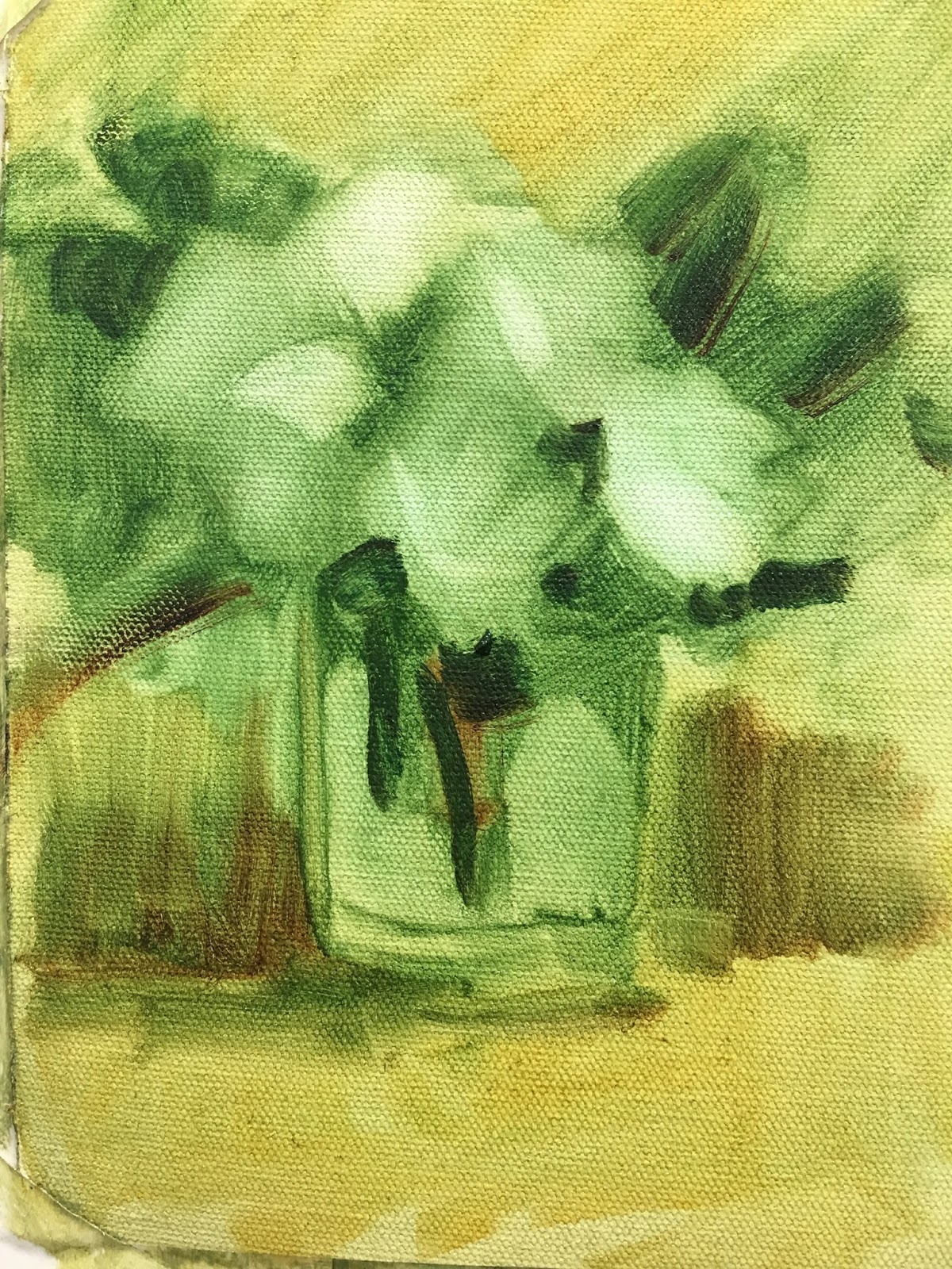
This was a demo to show the importance
of having a transparent underpainting.

Artist Note.

I am a big believer in leaving
some of the darker areas in
 a painting, transparent. 
There is a certain glow which 
doesn't happen with opaque
dark areas  - in fact I find
they can look, pretty "chalky."

My transparent colors 
used for the demo were:
Viridian
 Transparent Oxide Yellow TYO
Alizarin (permanent)
Ultramarine Blue.

 After a wash of TOY 
I did a mass shape using  Viridian.
Next I lifted out the lighter areas
using a rag.

I followed this with more lifting
with a small amount of Gamsol
on my rag and a scrubby brush.
This was to hit my lightest areas. 

I added Viridian and Ultra 
with touch of Aliz to make darker
greens in jar and leaves.

I added more TOY to back and front.
and shadowed the area 
behind the jar
 linking into the dark leaves

Bringing in color but making
sure to keep it all transparent.

Then the fun part - I fractured it!
(See FREE tutorial on tools and what
I use for fracturing  HERE )

I enjoyed bringing it back 
into form by
 taking advantage 
of the broken areas to add 
interest 

Now into the opaque colors.
I added 
Titanium 
Permanent Yellow and 
Permanent Red light to my palette

I started using a knife and a brush
at this point. 
I left the flowers 
very abstract on purpose. 
That was the easiest part -
 because they were all imaginary.

There are transparent areas
peeking through the opaque 
marks, and to me it makes 
for an exciting surface.
Thick - thin,
transparent - opaque,
warm - cool.

If you are not already using the
transparent colors - or have not 
used them for a while then
please let me know if you are 
inspired to try them.

Happy Painting
Enjoy your weekend.


Monday, February 29, 2016

New Home - Leap Year


New Home
11x14' oil on linen SOLD

this was a demo and the white blob
at top right was taken care of
later.

Artist Note.
I arrived in this country 
from England
on a February 29th...yes,
a Leap Year.

My new forever 
home and country. 

I had not wanted to 
leave my family and friends,
but my husband had a
job opportunity 
too good to pass up.
I remember crying to 
my mother that I didn't 
want to leave England and 
she said..."you go where 
your husband goes."
But, she was crying too.
I had an 8 month old
child she must 
have hated to see go.

I remember how
I felt so out of place
and in awe at the size
of everything - 
from the skyscrapers
and cars to the food servings.

I was from a big city with 
great transportation and 
I had never learned to 
drive...but I was a fine walker!

Coming from England
I presumed there would
be no language difficulties,
but found my ear for 
American-English 
was severely lacking
and apparently...
 it was reciprocated.
I was from the north
and had an accent.
I had to repeat myself 
all the time.

The years flew by.
I had another child.
I became a citizen. 
My friends 
became my family 
and I truly  fell in love
with the amazing USA
...warts and all!

Today I celebrated
another one of my every 
four years anniversary
with deep gratitude.


Wednesday, October 8, 2014

Waterfall and Demo


Waterfall
8x6in oil on canvas
work in process

Artist Note.
Working from a gesso mono print
and using the imagination.

First Step.
 See video showing 

I started with a gesso mono print made by
using both black and white gesso.
I used a Raymar canvas board to press into 
the black and white gesso mixture. 
Paper does a fine job also.

I lifted it off and turned the board and 
pressed down again leaving the above image.

Using my imagination I looked for shapes 
I could already "see"  a subject forming from.
There it was...
The angle of gray running across made 
me think of water and rocks.
The texture made from the gesso was great.

I used transparent colors to test out 
the imagery and I could have painted the
whole painting this way if I wanted to. 
Building layers of glazes and scumbling
in some areas.


This is where the individual's own response 
has to be listened to. I decided to go into 
it with the palette knife...and had a heck of a 
lot of fun. In fact I am still nibbling at it.

The role of imagination in painting is not necessary
to be a good painter. 
In my opinion, it IS a necessary exercise to explore
everything you can to find out if that little voice
inside responds with pleasure - or not!
A multitude of pleasures eventually becomes our
own distinctive style.

To see a sample using paper from my 
September 27th post of this technique

Monday, January 20, 2014

Denim and Broom


Denim and Broom

16"x12"  oil on canvas  unfinished

My demo piece from yesterday.

It was my husband who asked me to do
a repeat of a small painting I did last
January. It was one he had always liked

It was a warm and friendly group.
I relaxed pretty quickly when some of
my support group turned up and made
me laugh.


The pressure I had shared was because I
donated a one-day workshop for
a fundraiser next Saturday.
Some of the sign-ups had come to see
me at work.  Can you imagine if they
decided to cancel based on what they
saw!!! All the wonderful and supportive
comments made me feel good, but
we all recognize that anyone using
hand/eye coordination can have a not
so good day. I saw David Hockney
walk out of one many. many years ago.
Anyway, I did some parts very well
and some parts not as well. All in all
a typical Julie demo.

Artist Note
I had two sheets of canvas.
One black gesso
and one white oil primed linen.
I wanted to show the difference in the
finished appearance between the two.
Unfortunately I did not finish the linen one.
The painting at the top was done on
black canvas.
It gives a solid appearance quickly. I used
opposing strokes to give some variation
of value and laughed with the audience
about the popularity of paintings on
black velvet -  back in the day.

I do not have much recollection of of
the steps I took but I remember


someone asked me
what brush I used so I took out my
fan brush to show the type of brush is not
as important in the beginning because
it should be all about getting down the 
basic shapes.
You can see the big shapes clearly below.


I wanted them to see the glow you can
achieve by using transparent colors first.
They peep through here and there as you
apply thicker paint.
This is as far as I got on this one, but am
looking forward to finishing it.
I should have asked someone to take
step by step photos but I will make sure to
take them as I finish this one

Monday, December 9, 2013

Window Study


Window Study

8x6in oil on canvas panel  SOLD

This is the first window oil painting study done
using the watercolor painting as reference.
It has a really unfinished look to it, but
a lady saw it and liked it just the way it was.

Artist Note.
I start another 3 day workshop on Wednesday
and am looking forward to it.
One of the artists from the previous one
emailed me these images below of  a demo
I did.


The one above had a transparent
underpainting before the opaque colors
were added. Here the light/dark patterns
can be seen with some fracturing marks.


When I do a straight line I prefer to
use a credit card or knife. It prevents it
from appearing too perfect. I have added
the light on the window, the flowers started
and it looks like I had also done the window
frame. By the way - that is not MY
Chico card!


Shutters added - remembering to paint
the area in shadow a cooler blue.
and here I am using the
knife on the foliage. Sometimes I use the
flat part underneath and MUSH for softness,
but here I am adding some texture by
placing paint on with a slight downward
swish.
Sorry I do not have a finished photo.
I thought some of you may be interested
in seeing some of the process.

This is a really busy time for me and sorry
I am not answering all your interesting
and encouraging comments. I do appreciate
each and every one of of you and thank you.

Posted by Picasa

Friday, August 17, 2012

Apple Demo for Class


Apple demo for class

not for sale

Working with a different group I did another apple demo.
Maybe you remember that in the classes I teach, the focus this month
 is painting from the imagination so these are not copied from real apples.
It appears that the hard part of painting from the imagination
is understanding the light and how it falls on a surface.

Seeing how many in the class had painted light on the sides as well as the top,
I quickly drew in the box showing the apple with a top surface to
catch the light. They immediately "got it" and some pretty decent apples
were presented.


I am always using the phrase, "light follows form," but I found
that it is not always understood. Another way of saying it is...
The path of light can not go around corners.

Different methods of broken edge work and colors were also included in
this little demo so this may appear a little weird, but I thought it may be
of interest to those who do not have access to instruction.

Having a great time with my wonderful grandchildren but admit
to being tired after teaching all day and then building a fort
(from a precious sari) to play cowboys in. I got the midnight watch!


Posted by Picasa

Tuesday, August 14, 2012

Hydrangeas and Part Demo


Hydrangeas

8x6in  oil on canvas panel  $125.

Hydrangeas with sprigs of coffee bean plant.
These  hydrangeas have a lot of a creamy color in the center
with pale blue edges to the petals. I got them at Trader Joes
in Albuquerque at weekend. They are not perky!

Artist Note.

This was a demo done in class today.
I had a lovely set up using the the reds of the strawberries from
yesterday to move the eyes around from the coffee bean buds.
I blocked it in like this.


Then I realized I would not be able to fit it all in in time.
So  - off with the strawberries heads!


Using my wonderful, handy tool.  Love this part!
If interested in seeing tool and how it is used, go to
(May 2nd, thru 5 or 6.)
 http://juliefordoliver.blogspot.com/search?updated-max=2012-05-12T19:58:00-07:00&max-results=10
You have to scroll down to get to the correct dates.

I then had to change the vase. Why? To link to the blues of the hydrangeas
I had used a dark green vase first to link with all the leaves,
and the design on the strawberry bowl
had blue in it to link with the flowers.
See how changing one thing can lead to rethinking the other areas.

All these decisions are made with the class watching and
I give the reasons why... and it can lead to some lively discussions.


Posted by Picasa

Tuesday, May 1, 2012

Demo for the Guild


Demo for the Guild

14x11in oil on linen   not for sale

This is the demo I did for the afternoon session yesterday.
It is not a finished painting and there are still a few things
I want to take care of.

Artist Note.

Below is the underpainting. The rose colors and greens are done using
 transparent colors.


I notice the dark green at the top of
vase is too strong and is basically right
in the middle of the canvas.


I lifted off the green paint on the vase and repainted it a
solid white...well, slightly different shades of white!
    See below.


The single rose was too full-on and
competed for focal point. I slightly turned it sideways and added leaves.
I changed the color of the band on the bowl and placed a couple of
petals in water.
I allowed the shadows on the right side to balance the weight
of the cluster of objects on the left.

The general opinion of the group was an appreciation
for seeing the changes take place and the reasons why.
Painting is always an adventure and an understanding audience
makes demos much easier.


Posted by Picasa


Wednesday, April 4, 2012

Apple Blossoms


Apple Blossoms

 11x14in demo -  not for sale

This was the afternoon demo on Monday.
I used another oriental inspired vase as I think it enhances the beauty of these blossoms.

Artist Note.

This was started with a pink tones canvas and then I lifted out the basic design using a cloth
wrapped around my finger- same method and steps as on previous blog.

I went into a tiny bit of fracturing on the flowers and background.
Still exploring how to do that.

Posted by Picasa

Spring Beauty


Apple and Cherry Blossoms

11x14in Unfinished demo - not for sale.

This is one of two demos I did yesterday. The apple blossoms have beautiful pink buds and the cherry Blossoms grow in clusters of round shapes  and are creamy white.

Artist Note.

I started with a pale, blue toned canvas and lifted the light areas off with an old cotton sock.
(I have a wonderful friend who passes on her sport socks to me...still pristine.)


Next I painted transparently to establish
important dark areas. I find it helps for me
to keep loose at this stage
so I use a big brush. #12
I have a habit of painting yellow
for the light
areas if the light source is warm.


                                                     Moving into opaque paint I
shape the cherry blossoms balls
to establish the values and form.
This is a close-up of
the foundation for the Cherry blossoms.
(Looks like a little cabbage!)
When I paint the flowers in top
most of the green will be gone


I mixed two batches of blue for the
pattern on the vase.
Paler for in the light and a darker
blue for the shadow area.
I ended up changing this in the painting
as it dominated too much. I had to decide
if the blossoms were the point of interest
or the vase.

Tomorrow I will show the other demo I did yesterday .

3 comments:

  1. Just love your tutoring, this piece is stunning, looking forward to seeing next demo.
    ReplyDelete
  2. Lovely. I like the looseness of the blossoms. Very interesting how you painted those green "cabbages". It worked out beautifully.
    ReplyDelete
  3. I especially appreciate the photos and explanations under "Artist Notes". I'm saving them all. Thanks.
    ReplyDelete

Posted by Picasa

Monday, February 13, 2012

Sunday Morning Drive in Nambe, NM


Sunday Morning Drive

11x14'  oil on canvas board.  not for sale.


This was from a photo I took when a friend and I were roaming the area
of the beautiful old village of Nambe, New Mexico, looking for some place
to paint and more importantly, where we would be allowed to set up our gear.
This turned out to be a place where we were moved from... before we ever started.
I was allowed to take a photo.

Artist Note:

This is the demo I did in class today.

The first block-in is my favorite part. Lots of fun to place colors and not
worry about getting it right.  Below you will see I placed simple shapes
defining the different elements. I did pay attention to the warm and cool colors.
They show up well on the trees in this shot.


I used only transparent colors before I started going into the
opaques to establish my light areas.
This is the first time I have done a painting with yellow stripes in the road
but the road looked like water without them. How did I know that?
I had an audience of expert artists. Demos can be nerve racking!


Posted by Picasa

Thursday, February 2, 2012

"Wine and Roses"


"Wine and Roses"

8x6in  oil on canvas board   100.

This is the demo I started yesterday. I completed it this morning.
I love the colors in this piece.

Artist Note,

This emphasis for this demo was on placing single strokes at the beginning and being careful not to blend them plus the breaking up of edges. If you look carefully you can see most of the edges are broken up by a brush stroke OR by having the similar values but with a color change ( which I refer to as a transition color) placed next to each other. See below.


Straight edge side by side. Crisp!


A transition color in-between light and dark
softens the edge


Multiple direction and value changes.


I do try to keep some sharp edges, especially in the focal area so the painting does not go all mushy on me.
Posted by Picasa


Monday, January 16, 2012

Demo of White Tulips


Demo of White Tulips

6x6in  oil on canvas board    85.

One of the wonderful things about bulbs is that we can get beautiful, spring flowers in the dead of winter.


Artist Note:

This demo was done for the Artists Guild of Southern New Mexico, this morning.

The inspiration began last Thursday in the egg tempera class when
 another artist brought in some beautiful white and yellow tulips.


The artist raised the question of wanting to try a more contemporary approach using the egg tempera so I did the quick wash sketch below to show how cropping could simplify it.


There was something I liked about the egg tempera sketch so I thought I would try and see how it translated into oil. Keeping the lower, right area in a warm color and an upside-down 'L' shape for the dark pattern I blocked in the basic shapes with more fluid paint - adding an extra tulip, knowing it could easily be re-sized or removed. I was careful not to refer to the photo so I would not get caught up in detail.


For the final finish (at top) I used a #6 bright with short blocky strokes and slightly thicker paint, working all over each area to finish it off.
Making sure to vary the whites and open up the focal tulip so they would not all look too similar, I then made the third tulip smaller and added light and shadows on the leaves, followed by some small adjustments with warm and cool touches. Compare the top one with the one above to see what I mean.


Posted by Picasa