Personal Art Blog

Sharing the lessons I teach at the Artist Guild and the personal discoveries in my art.

Wednesday, September 18, 2019

Apples & Monet

Apples & Monet
6"x8" on canvas mounted on board  $150.
Purchase HERE

Artist Note.
Still having a great time using 
colors from one of  Claude Monet's paintings.
It happened like this...

A friend gave me some apples from her garden
(They were greener when I got them)


What to do? 
Which color harmony did I want?
I painted them Saturday quickly without a set-up

I wanted to go high key 
meaning -
only a small amount of dark below a middle value.

But on Monday, at the guild,
we all worked 
on finding the colors Monet
used in his beautiful painting below.
The Japanese Bridge.


Work on the easel
shows the print in a plastic sleeve.
(top)


After doing an exercise of mixing
then matching the
Monet colors on top of the print,
I was left with really
beautiful colors on my palette.
I started a new water lily painting
(lower left)
then worked on the top of the
apple painting. (lower right.)

I like the colors surrounding the apples
MUCH better.
Thanks to Monet for the inspiration.

Saturday, September 14, 2019

Waterlily Pond

Waterlily Pond
6"x 8" oil on raymar panel $150 SOLD

Artist Note
We are still using Monet's color harmonies
as the focus at the guild this month.
In the one above, I have used the
Analogous Harmony of blue and green.

This is painted from a photo I had taken in
 Cloudcroft, NM, but I have a good friend
who has just returned from a trip
to Giverny Water Gardens
and I am excited to see her photos.

It means my series of lily paintings
will get a shot of inspiration
in my painting arm!

Tuesday, September 10, 2019

Abstracted Landscape plus Monet Inspiration


Cloudy Skies
8X6" oil on Raymar panel $150.
Purchase HERE

Artist Note
In this painting my goal was\
abstracting to only the
main shapes
of what I saw in the landscape.

I used colors from one of
Monet's Landscape themes.
It is a great way to learn how
 he really used a LIMITED palette.
The same few colors mixed
in different proportions
make for an interesting
 harmony.

 Below, left, is another Monet waterlily painting
You can see how I matched the colors 
on the plastic sleeve overlay before
using them in a still life of my own.
Scraped and gone, the painting exists no more
but it was a terrific lesson on the green
because I found it was mixed
from yellow and purple.
Reddish purple and blue purple.

Wednesday, September 4, 2019

Roses In A Square (click on to go to blog)


Roses In A Square
8"x8" oil on raymar panel  $200.
Purchase HERE

Artist Note.
I am rather pleased with this one.
I feel the new fracturing marks work well 
and I really like the colors.

I came up with the colors from a 
Monet Painting.
I am using his waterlily work for 
 this month's Guild's focus 
which is on Color harmony.

This one is the Analogous harmony
  that is
where you follow the color wheel.
In this case, green, blue,
with a dip into the purple.
Monet's emphasis was on the blues
Mine, the greens.
I had pre-mixed all the colors 
that he used, testing them first
on the plastic sleeve 
 the photo was placed into.

I then used them in this still life.
The proportions of the colors
 are different of course.
His lily colors are my roses
His green tree reflections are my leaves,
and the different blue colors 
are my background. 
His accent of purple is my vase.

Have you used a famous painting 
to give you ideas for
your color harmony?

Sunday, September 1, 2019

Waterfall in Woods

Waterfall In Woods.
8"x6" oil on Raymar panel $150.
Purchase HERE


Artist Note
I have been back painting
 landscapes recently
and am once again reminded
of how cool the shadow colors
are in comparison to
the same colors in the sunlight.
The difference between the green
growth in the light
compared to the same color
in the shadow was HUGE!

The blue of sky comes down 
and casts its color over everything.

It is so obvious with water
showing blues in the shadow
Not as easy to see
the same cool cast on the green.
You have to learn to look for it!

I send prayers for everyone 
in the path of Dorian
remembering also 
that animals are voiceless...
they need help too.


Wednesday, August 28, 2019

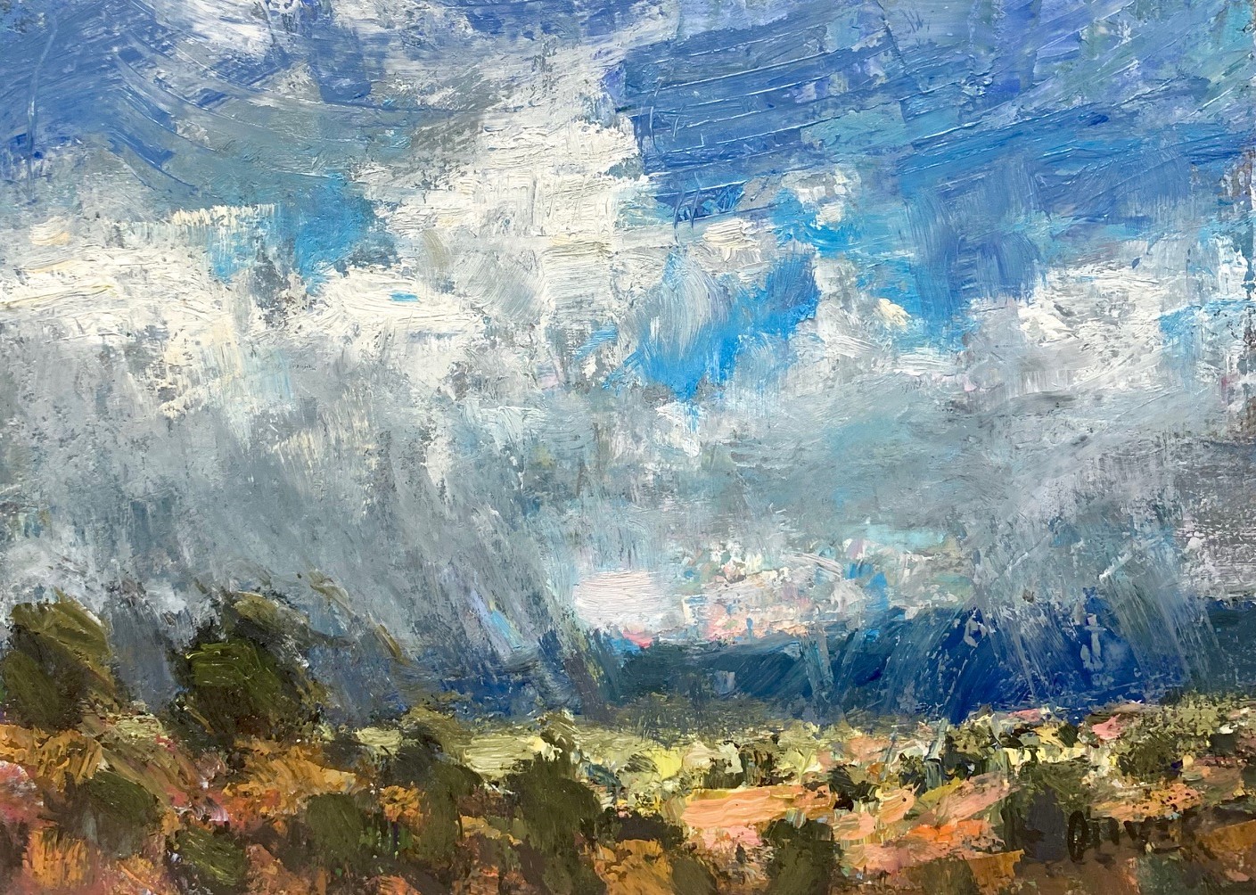
Stormy Sky, New Mexico

Stormy Sky, New Mexico.
6'x8"Oil on Raymar panel $150.sold

Artist Note

The cloudy skies are always fabulous
during our monsoon season.
I went outside for this one.
Had to finish it up in the studio
after the wind whipped it
right out of my hand.

On the previous post
I linked to a video
showing how I painted a landscape.
I received some remarks about it
not showing on the front page.
I did place two links,
one lower down,
in case this happened.

I have found out that
people do NOT click on the
heading to see the full blog post
but stay on the email version.
I am one of them. Who knew!!


Monday, August 26, 2019

Tree By the Pond - video


Artist Note

This video is 9 minutes +  long.
Wish I could paint this fast but is 
apparently better to show them this way
or everyone loses interest!

I have my palette up next to the painting
so the colors I mix are easily seen.
Titanium White, Lemon Yellow, Yellow deep, 
Permanent Orange, Permanent Alizarin, 
Ultramarine Blue, Ocean Blue,
Transparent Brown Oxide, Ivory Black.

I painted this from a color study
done plein air by the pond
and you can maybe catch a glimpse
of it up on my left.

If the above doesn't play - I did
another  link to the video 
below.


Hope you enjoy it . 

Monday, August 19, 2019

Violet Time

Violet Time
9"x12" oil on  raymar panel
(Not sure it is finished)

Artist Note.

I was at the garden center
and walked into a room which had a table
full of all colors of African Violets.
Gorgeous... I knew I wanted to paint
them so I bought a few pots.

You are all sharing my journey
into fracturing in new ways.
I have to be open about it because
It takes a long time to develop
something so it becomes 
completely natural. 
 and you would forget me.

It takes a lot questioning,
 asking if ..."I like that" 
or "I don't like that"
 most importantly...
understanding the " why " of the answers.
In the violet painting, for example,
there are two areas I am not sure about.
Be good to mull it over.

I have found TIME is the only way
to discover if it is
possible to incorporate
something new
into what is already a natural technique.


I am not sure that trying to paint
small flowers at this stage of
experimenting was smart because
it was very frustrating.
Put them in - take 'em off
repeat... until feeling quite inept.

I have signed it but am not sure
until I have
lived with it for a while
if it is going to
survive.
Or ...come to think of it...if I will either!
only kiddin'


Tuesday, August 13, 2019

Crape Myrtle Bouquet


Crape Myrtle Bouquet
8"x 8" Raymar canvas panel $200.
Purchase HERE

Artist Note
The Crape Myrtle trees are blooming like crazy
just a few steps outside my studio.  
Loaded with blooms they are so beautiful.

How fortunate to be in a downtown which
has flowering trees. 

You can see my experiments with
fracturing the paint and mark making 
are still continuing. 
It is an interesting process.
Bit by bit I am taking note of what 
I respond to and in what way...
positive or negative. 
I have no idea how it will all end up
but I am enjoying the freedom
and interest.

Saturday, August 10, 2019

Clouds & Sunshine

Clouds & Sunshine
6"x 6"oil on Ray-mar panel  $110.
Purchase HERE

Artist Note

A small plein air painting.

We are focusing on color and values
in class this month so I wanted to 
jog my memory a bit on the difference
between painting from a photo
and getting out and seeing it.

Shadows are MUCH lighter
and transparent outdoors 
but look darker on a photo.

Verticals are always darker than horizontals
(The same color will be darker as a vertical
when light source is above)
...and the distant, horizontal ground
is the lightest area after the light on the clouds.

We all see color differently and I like to
punch up the actual colors I see
so below is the plein air painting
and you can see how it started
with a strong light dark pattern
of neutral colors...


I know some of you will prefer it
one way over the other
and that is why it is important to paint
what YOU like best for yourself.
Personally...
I love a bit of color

Enjoy your weekend
and thanks for visiting.