Personal Art Blog

Sharing the lessons I teach at the Artist Guild and the personal discoveries in my art.

Sunday, March 11, 2012

Totally Simplified


The Simplified Landscape #2

 6x8 in oil on canvas board  100

Continuing my quest of personal discovery towards abstract art.

This one was painted intuitively, using my painting memories from the previous
day's sunset landscape.

Symbols:
I took the yelow colors of a sunset, a blue horizontal line for
mountains or horizon and placed a dark shape for something growing. The layering
and overlapping visually creates perspective even though they are flat forms.

To me it is still obviously a landscape, but if I turned it like this...


... then it becomes a true abstract.


It is our ability to recognize symbols as "things" which makes our imagination fill in for us. If we tend towards enjoying realism then we will be  the type who sees faces, animals etc in the clouds.


I cropped a different area out of the same painting
and turned it upside down.

In a realistic landscape, the eye is not always comfortable with a dark top and much lighter bottom.
Is your eye comfortable with a dark top in an abstract?

Or does it prefer a lighter top area?

I find as soon as I have the lighter area at the top it became a landscape again..a drunken view maybe?


This has been a good exercise for me.  Especially after I worked on the emotionally engrossing series of my mothers pottery.

A lot of how I paint is recognizing what brings me the most pleasure and aiming for it.
I live in a world full of objects and each object has a shape or form. House, car, apple...
I love to render what I see so I would never want to be a totally non-representational painter.
Back in the day... I did for a while and found it did not hold my attention, but I do enjoy
looking at abstract art. My taste is so varied. Take a gander at this list.
Picasso, Motherwell, Vermeer, Turner, Van Gogh, Gauguin, Klee, Rothko,Twachtmann.
And many, many others.

If this your first visit because of the Liebster Blog award, please take the time to scroll back a few
days to see my regular work. Thank you.


Posted by Picasa

Saturday, March 10, 2012

Lucky Me!

My good news...
I have been awarded with Liebster Blog Award by Helen Moreda This award is given to bloggers who inspire you and have less than 200 followers. The Liebster Award takes it’s name from the German word meaning Beloved, Dearest or Favorite.

I am thrilled and honored to receive it. Bless you Helen and many thanks


As part of the tradition it is passed along to 5 bloggers that have
motivated and inspired.
To accept the award you must:

1. Link back to the person who gave it to you and thank them

2. Post the award to your blog

3. Give the award to 5 bloggers with less than 200 followers
that you appreciate and value.

4. Leave a comment on the 5 blogs to let them know that they have been offered this award.


Now for the hard task of picking my five choices..


Always supportive of other artists plus she freely shares her painting knowledge in a wonderful journey of exploration and success.

Hilda Muxo
Shares her stories with beautiful pastels full of emotion. She is another painter who finds time to support her fellow artists.


Lynne Windsor
A New Mexico painter and print maker, currently in England learning different printmaking skills. Awesome work.

Haidee-jo Summers
Interesting and personal art viewpoints from a fun and talented artist who lives between England and an island in France                               
                          
Nora MacPhail
A wonderful supportive and sharing artist who works brilliantly with line as well as watercolor. Amazing !


Congratulations to the five of you and I thank you for motivating and inspiring me.

There are so many more who bring me great pleasure and inspiration. It is a shame there can only be five getting the award but would like to mention two others.

Jane  From Italy and works in watercolor. She has constantly encouraged me ( she has over 500 followers!!!)

Lisa Graham  has a unique and really great blog full of innovative art.


Please check out the above blogs to see what wonders they perform in their chosen medium.And please check out Helen 's( who nominated me) blog. 

Friday, March 9, 2012

The Simplified Landscape


The Simplified Landscape

6x8in oil on canvas panel   SOLD

On a quest to seek personal inner reactions to abstract art.

You can see I took yesterday's landscape (see below) down
to its simplest forms.
Even though I abstracted the landscape into interlocking, flat shapes
they still strongly suggest a landscape by the horizontal format,
form and color.

Below you can a see a reminder how yesterday's painting was
impressionistic in its approach.


Tomorrow I will take it closer to pure abstract.


Posted by Picasa

Thursday, March 8, 2012

March Sunset


March Sunset

6x8in  oil on canvas panel  $100.

This is a beautiful and typical sunset here in New Mexico.
Believe it or not I toned this down to make the colors look more real.

I am going to be doing a few landscapes to see how abstract I can go
But first...do you want to see this morning's sunrise?


Posted by Picasa

Wednesday, March 7, 2012

Calla Trio


Calla Trio

8x6in  oil on linen panel  100.

The Calla Lily.
It has to be right up there with Freesia as my favorite flower to paint.

We usually take a trip to Portland in the spring where they are in
bloom in nearly every garden. A perfect elongated, trumpet shape, balanced
by leaves which can become quite wavy.

Artist Note:

This came out of a demo in class where the emphasis was on painting backgrounds.
In this case it showed the linkage of dark and light areas behind the callas.
Valuable to understand so you can  prevent spotty and disruptive
background areas. It is easy to see when it is obvious like this demo piece,
but gets harder when the subject becomes more complex.
Posted by Picasa

Tuesday, March 6, 2012

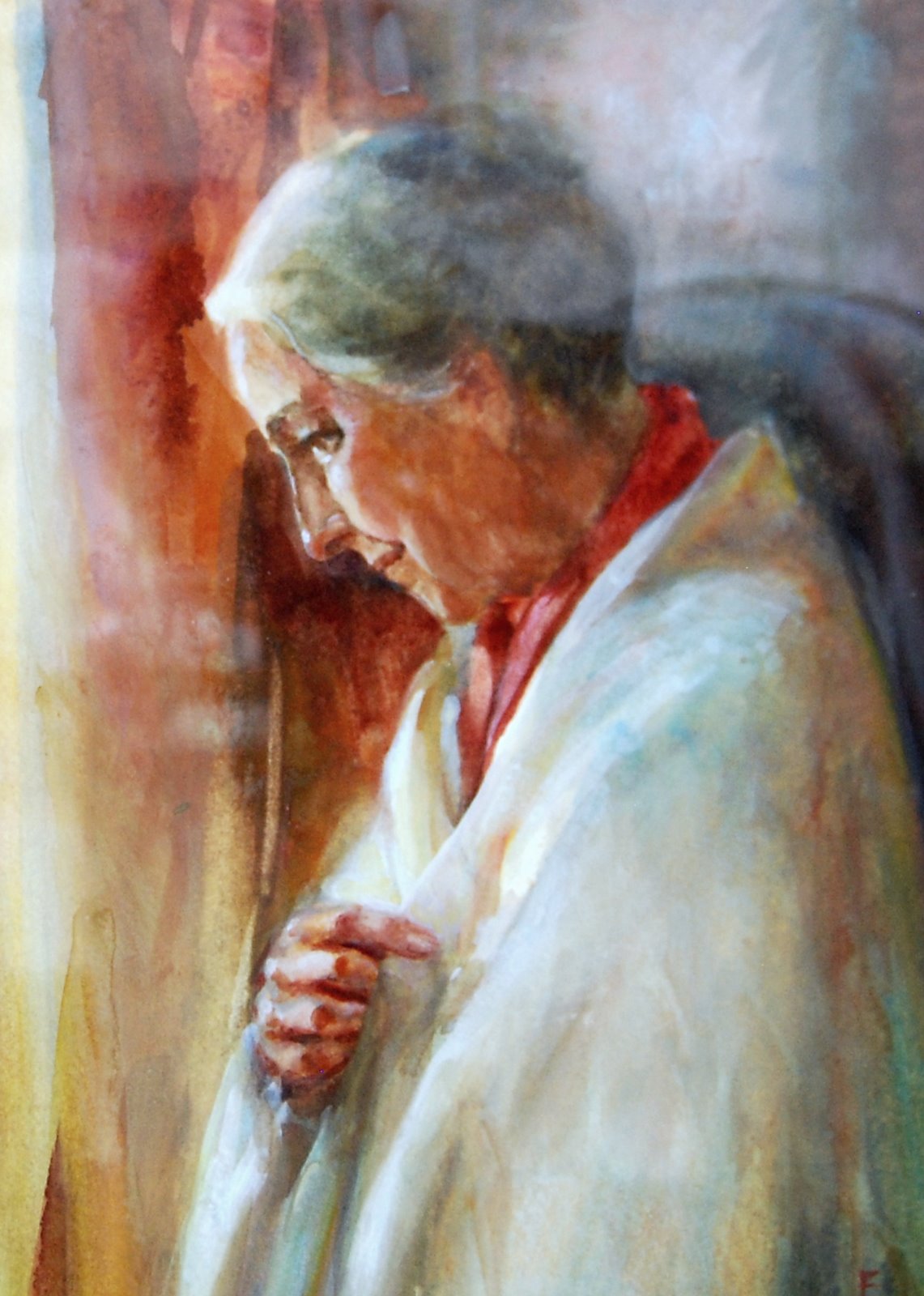
My Painting of Mother


A Portrait of Mother

Watercolor.    not for sale

You have seen her pottery so I thought you may like to see a painting
I did of her a couple of years before she passed on.
This painting is framed and I took this image through the glass so some
reflections are on it, but they do not take away from the strength
and kindness in her face.

The shawl is the one my aunt, her sister, gave me for my
first child's christening and is in many of my paintings ( it has a beautiful long fringe.)
While she was posing for this, mother told me stories I had never heard before about the hardships she and her sister endured growing up during and in the aftermath of World War 1.
I have been fortunate not to have had the same experiences..


Posted by Picasa

Monday, March 5, 2012

Mother's Pottery #11


Mother's Pottery #11

6x6in oil on canvas panel 85.

This bowl is more organic in its form than how I could possibly paint it.
It is my personal favorite of  my mother's pieces. It is beautifully made
with large, petal like shapes flaring outwards and no matching sides.
The arch shapes are totally contemporary and I find it amazing to realize
she was 81 when she made this piece. It was the last, really arty piece
she made as her vision was deteriorating.
The other ladies in class were speechless when it came out of the kiln,
but her teacher thought it was fabulous, as did I.
It sits on the kitchen counter and holds anything from fruit to flowers
and during the winter months I float flowers and candles in it.

This is the last painting of the series.
Painting it it has been a comforting, emotional experience on a deep level and
I have genuinely appreciated and been touched by the heartwarming
comments from viewers, either on the blog or by email.

Artist Note:

This was difficult to make look correct because it has undulating
free form shapes and is deliberately uneven so I depended upon the
top shape of the water to show its roundness.
The water was deeper than number 4 (with the floating lemon pieces) so it
was easier to do as it became a darker, warmer value.
As this painting is about the bowl, I made the pansies soft and more
muted than they were, but don't you think the colors are lovely
next to the blues?


Posted by Picasa

Sunday, March 4, 2012

Mother's Pottery #10


Mother's Pottery #10

8x6in  oil on canvas panel  100.

Mother made this wonderful plant pot and my daughter provided the
Calla Lilly plant.  (I have a very special daughter and she knows how
much I adore callas.)
It is also beautiful with hyacinths.

This is another piece made when mother was 80. When she presented it to me
I said something about the strong pink not being a color she would normally use and she
paused for a moment and then admitted that she had read the glaze container wrong!
It was the start of her loosing her central vision.

Artist Note:

This is painted on oil primed linen.  I use Centurion linen, oil primed sheets which come in a pad.
 I find it is a wonderful surface to paint on. For a start the paint responds
differently than on regular gesso and the colors are more intense. When dry, I will mount it with YES paste to a panel. YES is archival, acid free. I also use Miracle Muck. Another good one.

Posted by Picasa

Posted by Picasa

Saturday, March 3, 2012

Mother's Pottery # 9


Mother's Pottery #9

6x6in oil on canvas board  85.

I loved the set-up with the forsythia, but it may be hard for the viewer to catch.
This is an long oval platter behind a vase.
The platter was a new experiment for my mother. If you are following this blog you will
have gathered by now, that mother loved to try new techniques.
Know No Fear must have been her internal motto.
I think she was 80 years young when she did this piece. Inspirational, right?

It is an abstract landscape made with colored glass,  melted and fused
by the kiln onto the clay. The translucent brilliance of the blue and green
has to be seen to be believed.

My mother could not draw at all, (truly) so for her to attempt this abstract was
fascinating to me.
When someone would ask her if I got my talent from her she would tell them,
I can draw two things...my breath... and social security!
I still grin thinking of that!

Here is the platter

Posted by Picasa

Friday, March 2, 2012

Mother's Pottery #8


Mother's Pottery # 8

6x6in oil on canvas panel   85.

The greens and teals in this piece are gorgeous.  Mother loved these colors and was thrilled when they became available  at the center.
This is a casserole dish which I use for many things. I adore the shape.

Yesterday's blog image did not come through and I have no idea why.
Remember, if you click on the title of the piece, it takes you right to my blog.

Artist Note:

Red and Green - my least favorite combination, but I think the
strong brown helps diffuse it as does having the Teal color
mixed in there as well.
I painted the branches in to give a horizontal repeat of the brown rim.
This was to also break up the strong
kerplonk of a centered, focal object.


Posted by Picasa